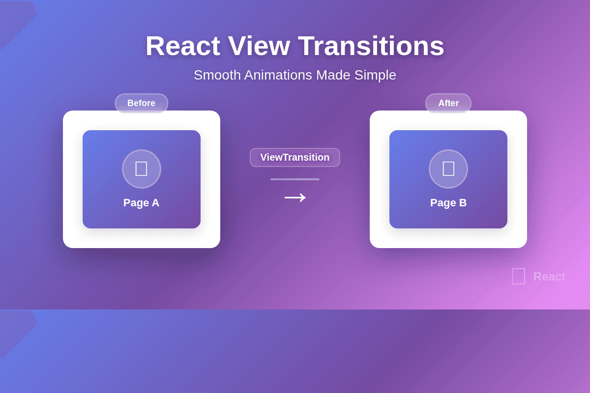
React's New View Transitions: Smooth Animations Made Simple
For years, creating smooth animations in React has meant reaching for third-party libraries or writing complex animation logic. But React's new experimental <ViewTransition> component changes everything by bringing the browser's native View Transition API directly into React's rendering cycle.
TL;DR
React's <ViewTransition> component (currently in experimental) lets you create smooth, native browser animations with minimal code. Wrap elements that change during a startTransition() and the browser automatically handles the animation. No more animation libraries for basic transitions.
Why View Transitions Matter
Think about the last time you used a well-designed mobile app. When you tap a thumbnail, it smoothly expands into a full-screen image. When you navigate back, pages slide with direction-aware animations. These transitions aren't just eye candy—they help users understand what's happening and maintain context as they navigate.
On the web, we've historically had to choose between:
- Complex animation libraries that add bundle size and complexity
- CSS transitions that break when elements mount/unmount
- No animations and accepting a jarring user experience
The View Transition API solves this at the browser level, and React's <ViewTransition> component makes it declarative and React-friendly.
1. Getting Started
Current Status
<ViewTransition> is currently available in React's experimental channel (as of April 2025). It's been tested in production but the API may still evolve based on feedback.
npm install react@experimental react-dom@experimental
Browser Support
The View Transition API works in:
- Chrome/Edge 111+
- Safari 18+
- Opera 97+
Firefox support is in development. The component gracefully degrades in unsupported browsers (content updates without animation).
Next.js Setup
If you're using Next.js, enable view transitions in your config:
// next.config.js
const nextConfig = {
  experimental: {
    viewTransition: true
  }
};

export default nextConfig;
2. Basic Usage
The simplest way to use <ViewTransition> is to wrap elements that change during a transition. Here's a theme toggle with a smooth fade animation:
import { unstable_ViewTransition as ViewTransition, startTransition, useState } from 'react';

function ThemeToggle() {
  const [isDark, setIsDark] = useState(false);

  const toggleTheme = () => {
    startTransition(() => {
      setIsDark(prev => !prev);
    });
  };

  return (
    <ViewTransition>
      <div className={isDark ? 'dark' : 'light'}>
        <button onClick={toggleTheme}>
          Toggle Theme
        </button>
        <p>Current theme: {isDark ? 'Dark' : 'Light'}</p>
      </div>
    </ViewTransition>
  );
}
What's happening here:
- The state update is wrapped in
startTransition()(this tells React it's a transition) - React captures a snapshot of the old state
- React updates the DOM to the new state
- The browser automatically crossfades between the two snapshots
The import uses
unstable_ViewTransitionbecause the API is still experimental. This will change to justViewTransitionwhen it's stable.
3. Route Transitions
One of the most powerful use cases is animating between pages. Here's how to add transitions to a simple router:
import { unstable_ViewTransition as ViewTransition } from 'react';
import { useRouter } from './router';
import Home from './Home';
import Details from './Details';

export default function App() {
  const { url } = useRouter();

  // Animate with a cross-fade between pages
  return (
    <ViewTransition key={url}>
      {url === '/' ? <Home /> : <Details />}
    </ViewTransition>
  );
}
The key={url} prop is crucial here—it tells React that these are different views, not updates to the same component. This ensures the transition captures both the exit animation of the old page and the enter animation of the new page.
Custom Route Animation
You can specify a default animation style:
<ViewTransition default="slow-fade" key={url}>
  {url === '/' ? <Home /> : <Details />}
</ViewTransition>
Then define the animation in your CSS:
/* animations.css */
@keyframes slow-fade-in {
  from { opacity: 0; }
  to { opacity: 1; }
}

@keyframes slow-fade-out {
  from { opacity: 1; }
  to { opacity: 0; }
}

::view-transition-old(slow-fade) {
  animation: 300ms ease-out slow-fade-out;
}

::view-transition-new(slow-fade) {
  animation: 300ms ease-in slow-fade-in;
}
4. Enter/Exit Animations
For conditionally rendered content (modals, dialogs, notifications), you can specify different animations for entering and exiting:
import {
  unstable_ViewTransition as ViewTransition,
  unstable_addTransitionType as addTransitionType,
  startTransition,
  useState
} from 'react';

function Modal() {
  const [isOpen, setIsOpen] = useState(false);

  const openModal = () => {
    startTransition(() => {
      addTransitionType('modal-enter');
      setIsOpen(true);
    });
  };

  const closeModal = () => {
    startTransition(() => {
      addTransitionType('modal-exit');
      setIsOpen(false);
    });
  };

  return (
    <>
      <button onClick={openModal}>Open Modal</button>
      {isOpen && (
        <ViewTransition
          enter={{ 'modal-enter': 'scale-up' }}
          exit={{ 'modal-exit': 'scale-down' }}
        >
          <div className="modal">
            <h2>Modal Content</h2>
            <button onClick={closeModal}>Close</button>
          </div>
        </ViewTransition>
      )}
    </>
  );
}
With the corresponding CSS:
@keyframes scale-up {
  from {
    opacity: 0;
    transform: scale(0.8);
  }
  to {
    opacity: 1;
    transform: scale(1);
  }
}

@keyframes scale-down {
  from {
    opacity: 1;
    transform: scale(1);
  }
  to {
    opacity: 0;
    transform: scale(0.8);
  }
}

::view-transition-new(scale-up) {
  animation: 200ms ease-out scale-up;
}

::view-transition-old(scale-down) {
  animation: 200ms ease-in scale-down;
}
5. Shared Element Transitions
This is where things get really cool. Shared element transitions let you animate a single element "morphing" from one position to another—like a thumbnail expanding into a full-screen image.
function VideoGallery() {
  const [selectedVideo, setSelectedVideo] = useState(null);

  return (
    <>
      <div className="gallery">
        {videos.map(video => (
          <ViewTransition name={`video-${video.id}`} key={video.id}>
            <Thumbnail
              video={video}
              onClick={() => {
                startTransition(() => {
                  setSelectedVideo(video.id);
                });
              }}
            />
          </ViewTransition>
        ))}
      </div>

      {selectedVideo && (
        <ViewTransition name={`video-${selectedVideo}`}>
          <FullScreenVideo video={videos.find(v => v.id === selectedVideo)} />
        </ViewTransition>
      )}
    </>
  );
}
The name prop creates a shared transition—when an element with the same name disappears and appears, the browser animates it from the old position to the new position. This creates that satisfying "zoom and morph" effect.
The browser handles all the complex animation math—scaling, positioning, even clipping paths. You just tell it which elements are the "same" via the name prop.
6. List Animations
Animating list reordering or filtering is notoriously tricky. <ViewTransition> makes it straightforward:
function TodoList() {
  const [filter, setFilter] = useState('all');
  const [todos, setTodos] = useState([...initialTodos]);

  const filteredTodos = todos.filter(todo => {
    if (filter === 'active') return !todo.completed;
    if (filter === 'completed') return todo.completed;
    return true;
  });

  const handleFilterChange = (newFilter) => {
    startTransition(() => {
      setFilter(newFilter);
    });
  };

  return (
    <>
      <div className="filters">
        <button onClick={() => handleFilterChange('all')}>All</button>
        <button onClick={() => handleFilterChange('active')}>Active</button>
        <button onClick={() => handleFilterChange('completed')}>Completed</button>
      </div>

      <ViewTransition>
        <ul>
          {filteredTodos.map(todo => (
            <ViewTransition name={`todo-${todo.id}`} key={todo.id}>
              <li>{todo.text}</li>
            </ViewTransition>
          ))}
        </ul>
      </ViewTransition>
    </>
  );
}
When you filter the list, items smoothly fade in/out and reposition. The name prop on each item ensures items that stay in the list animate to their new positions.
7. Custom CSS Animations
You have full control over how transitions look using CSS's ::view-transition pseudo-elements:
/* Default behavior: crossfade everything */
::view-transition-old(*) {
  animation: 300ms ease-out fade-out;
}

::view-transition-new(*) {
  animation: 300ms ease-in fade-in;
}

/* Slide effect for navigation */
::view-transition-old(root) {
  animation: 200ms ease-out slide-out-left;
}

::view-transition-new(root) {
  animation: 200ms ease-in slide-in-right;
}

/* Custom animation for specific named transitions */
::view-transition-old(video-*) {
  animation: 400ms ease-in-out morph-out;
}

::view-transition-new(video-*) {
  animation: 400ms ease-in-out morph-in;
}

@keyframes fade-out {
  from { opacity: 1; }
  to { opacity: 0; }
}

@keyframes fade-in {
  from { opacity: 0; }
  to { opacity: 1; }
}

@keyframes slide-out-left {
  from { transform: translateX(0); }
  to { transform: translateX(-100%); }
}

@keyframes slide-in-right {
  from { transform: translateX(100%); }
  to { transform: translateX(0); }
}
The pseudo-elements let you target:
::view-transition-old(*)- Elements leaving the DOM::view-transition-new(*)- Elements entering the DOM::view-transition-group(name)- The container for both old and new::view-transition-image-pair(name)- The wrapper for the animation
8. Advanced: Transition Types
For complex scenarios (like direction-aware navigation), you can add transition types dynamically:
import {
  unstable_ViewTransition as ViewTransition,
  unstable_addTransitionType as addTransitionType,
  startTransition
} from 'react';

function Router() {
  const [page, setPage] = useState('home');

  const navigate = (newPage, direction) => {
    startTransition(() => {
      addTransitionType(`nav-${direction}`);
      setPage(newPage);
    });
  };

  return (
    <>
      <button onClick={() => navigate('details', 'forward')}>
        Next Page →
      </button>
      <button onClick={() => navigate('home', 'back')}>
        ← Back
      </button>

      <ViewTransition
        default={{
          'nav-forward': 'slide-left',
          'nav-back': 'slide-right'
        }}
      >
        {page === 'home' ? <Home /> : <Details />}
      </ViewTransition>
    </>
  );
}
Now forward navigation slides left, backward navigation slides right—just like native mobile apps.
9. Browser Support & Fallbacks
Always check for support and provide fallbacks:
function navigate(url) {
  if ('startViewTransition' in document) {
    // Use view transitions
    startTransition(() => {
      setUrl(url);
    });
  } else {
    // Fallback: instant navigation
    setUrl(url);
  }
}
For critical animations, you can use the @supports rule in CSS:
@supports (view-transition-name: none) {
  /* Enhanced animations */
  ::view-transition-old(root) {
    animation: fancy-slide-out 400ms;
  }
}

@supports not (view-transition-name: none) {
  /* Fallback: simpler CSS transitions */
  .page {
    transition: opacity 200ms;
  }
}
React's
<ViewTransition>component already handles the fallback gracefully—content updates immediately if the browser doesn't support view transitions.
10. Best Practices
Keep Transitions Short
Aim for 200-400ms. Anything longer feels sluggish.
<ViewTransition default="quick-fade">
  {content}
</ViewTransition>
::view-transition-old(quick-fade),
::view-transition-new(quick-fade) {
  animation-duration: 200ms;
}
Respect User Preferences
Always respect prefers-reduced-motion:
@media (prefers-reduced-motion: reduce) {
  ::view-transition-group(*) {
    animation-duration: 0.01s !important;
  }
}
Use Names Sparingly
Named transitions are powerful but can be confusing. Use them for:
- Shared element transitions (thumbnail to fullscreen)
- Elements that need specific animations
- List items that should maintain identity
For general page transitions, the default animation is usually enough.
Don't Overuse
Not every state change needs a transition. Use them for:
- Route changes
- Modal/dialog open/close
- List filtering/sorting
- Shared element transitions (image galleries, cards)
Skip them for:
- Form validation errors
- Loading states
- Real-time data updates
- Rapid interactions (typing, scrolling)
Conclusion
React's <ViewTransition> component brings native, performant animations to React with minimal code. By leveraging the browser's View Transition API, you get smooth animations that would have required heavy animation libraries in the past.
The key advantages:
- Declarative - Wrap elements, specify transitions, done
- Performant - Browser-native, GPU-accelerated
- Flexible - Full CSS control over animations
- Progressive - Gracefully degrades in older browsers
Next Steps
- Experiment with the experimental release
- Read the official docs
- Try it in your Next.js app
- Explore the MDN View Transition API guide
View transitions are coming to React, and they're going to change how we think about animations in web apps. Start experimenting now, and your users will thank you for the buttery-smooth experience! 🚀


